ASEA POWER SYSTEMS
Brand Redesign


Overview
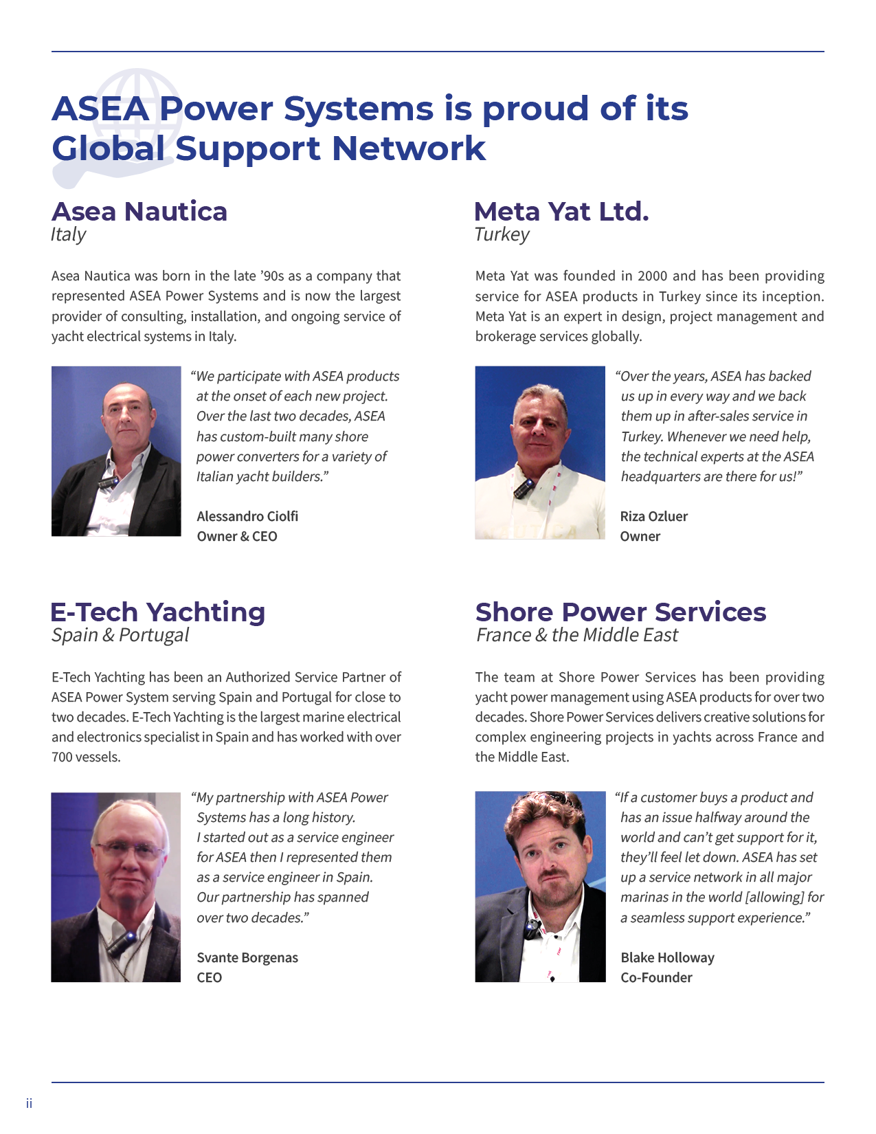
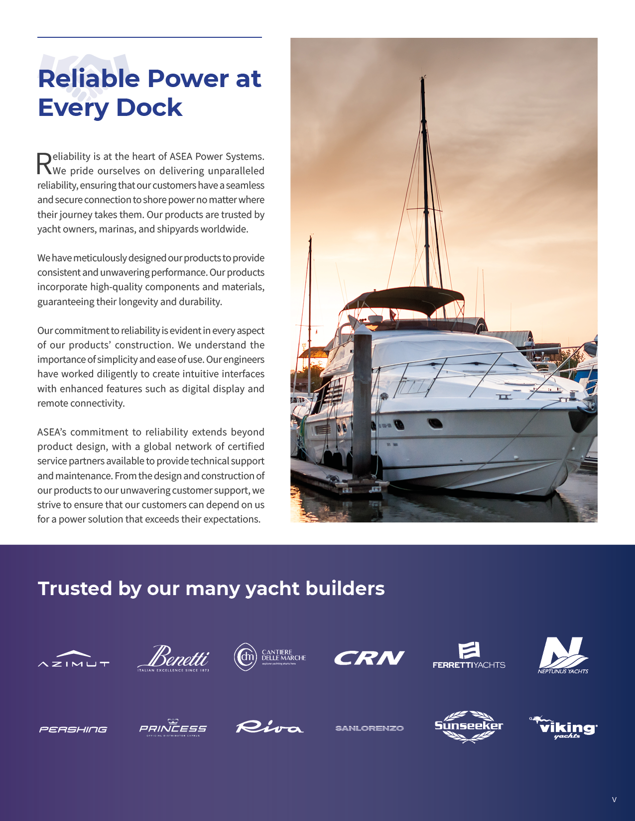
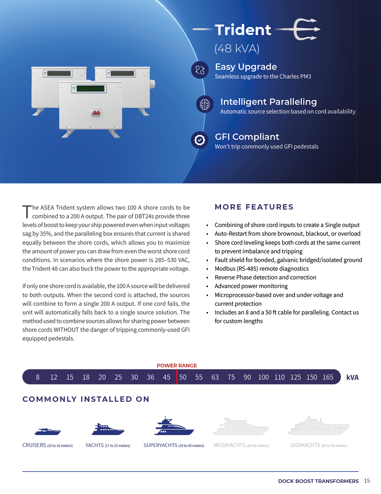
ASEA Power Systems (ASEA) sells power solutions for a variety of recreational and commercial yachts ranging but not limited to cruisers to gigayachts.I proposed and executed the company’s brand refresh, primarily through the company’s product catalogue and tradeshow materials.
Work on the company’s website is currently undergoing research and testing and not in this overview.


Process
Working with a Marketing Manager, we addressed the brand from both a visual and values aspect with the goal of better representing the quality and image the brand offers to its clienete.While she prioritized values and brand message, I oversaw communicating that message via design.


Iterations
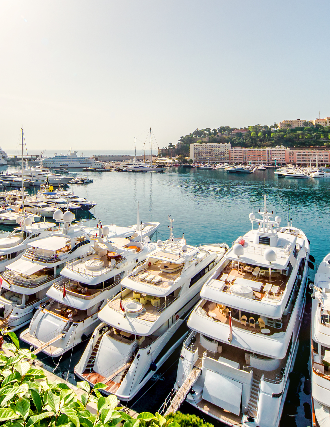
Through conversation with my supervisor who previously worked on marketing collateral, there was a shared interest in ensuring captivating images were the hero of the brand’s visual language. These images included yachts from our partners or audited images off stock image websites.We also played with increasing the use of our secondary colour, purple, potentially making it the main colour to help stand out among other like-brands in the industry.


Final Design
After reviews with our stakeholders, the team proceeded with continuing with blue as our main brand colour than purple (and to keep it as secondary). ASEA is already well known in the industry and agreed changing colours would not be the right business decision to retain brand equity.Stakeholders also agreed to proceed with prioritizing images that promote the concept of luxury and elegance. Moreover, by using brand partners images, we can communicate to customers which yachts have our products factory installed.