Corvum
Website Redesign

Overview
Corvum is a telecommunications service dedicated exclusively to law firms across North America.
I led and executed the redesign of the company’s website. This included, but not limited to redesigning web pages, restructuring the main navigation’s information architecture, producing web graphics and icons, writing webage copy, and refining task/user flows.
The overhaul included effectively implementing the company’s brand palette, improve visitor (and site crawler) navigation, and build flows to help with converting potential leads into customers.
I led and executed the redesign of the company’s website. This included, but not limited to redesigning web pages, restructuring the main navigation’s information architecture, producing web graphics and icons, writing webage copy, and refining task/user flows.
Process
Over a 45-day work span, I completed an overhaul of the company’s website in preparation for an upcoming high-traffic trade show.The overhaul included effectively implementing the company’s brand palette, improve visitor (and site crawler) navigation, and build flows to help with converting potential leads into customers.
Task Flow/Information Architecture
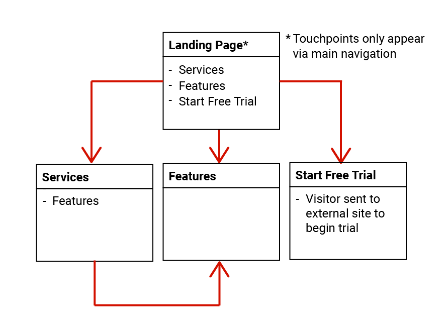
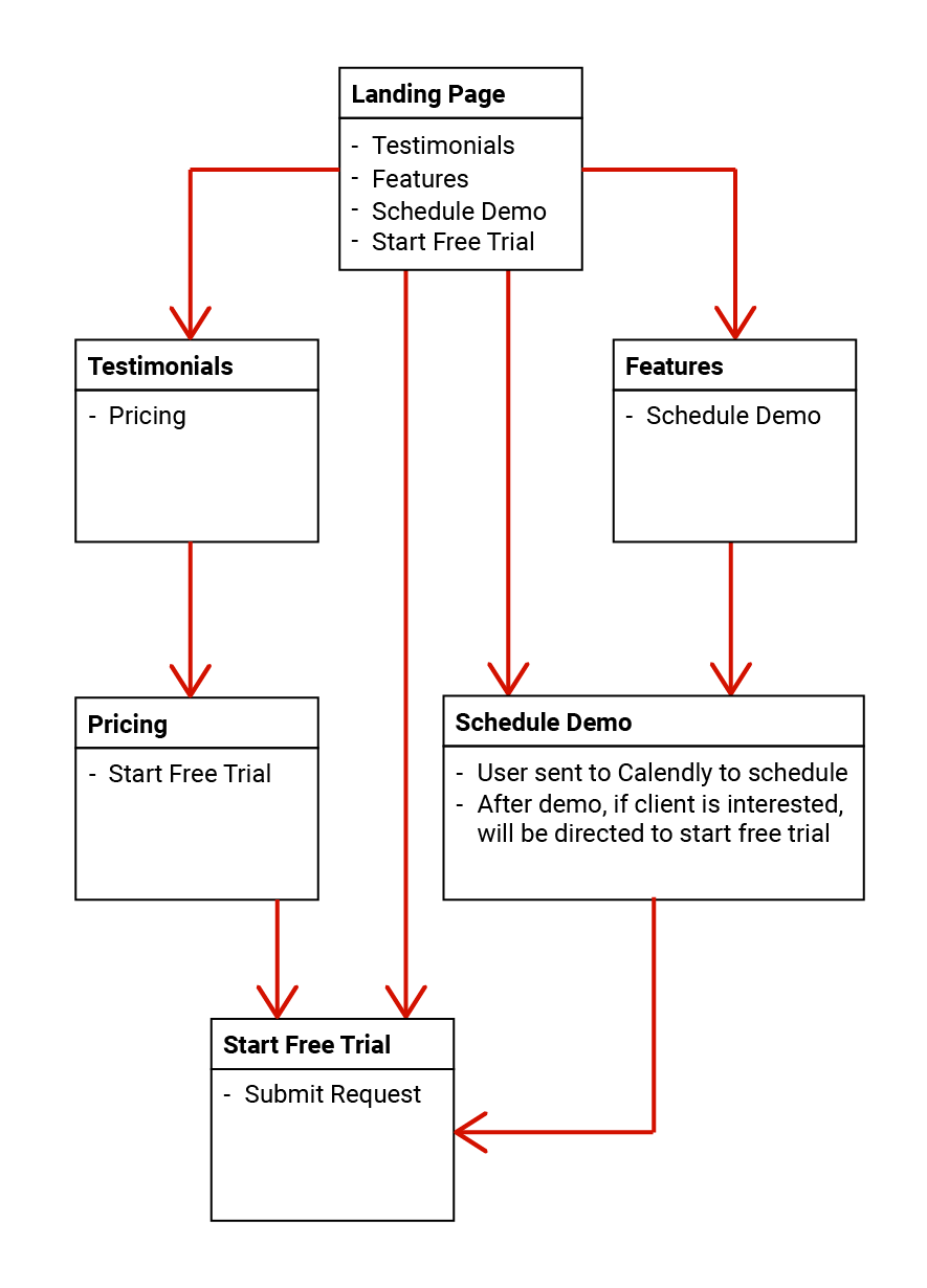
The original task flow did not allow for users to navigate and travel from one page to another, requiring them to use only the main navigation to travel.To approach this process, I researched like competitors and legal practice management software websites to understand how to align the redesign best with a conventional flow.


Creating UI
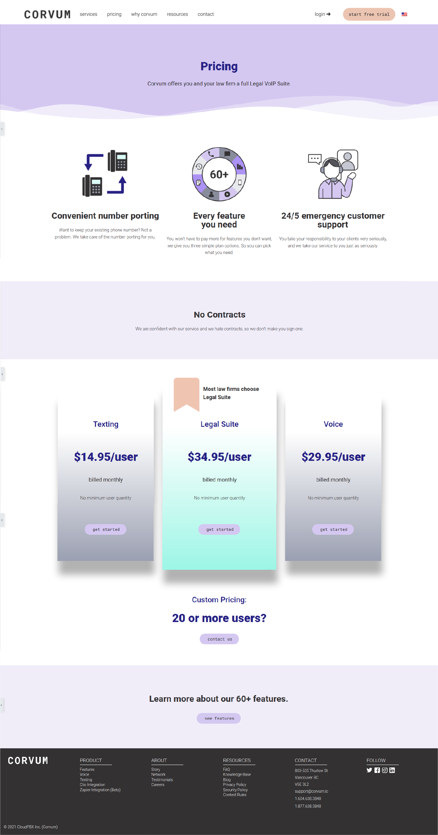
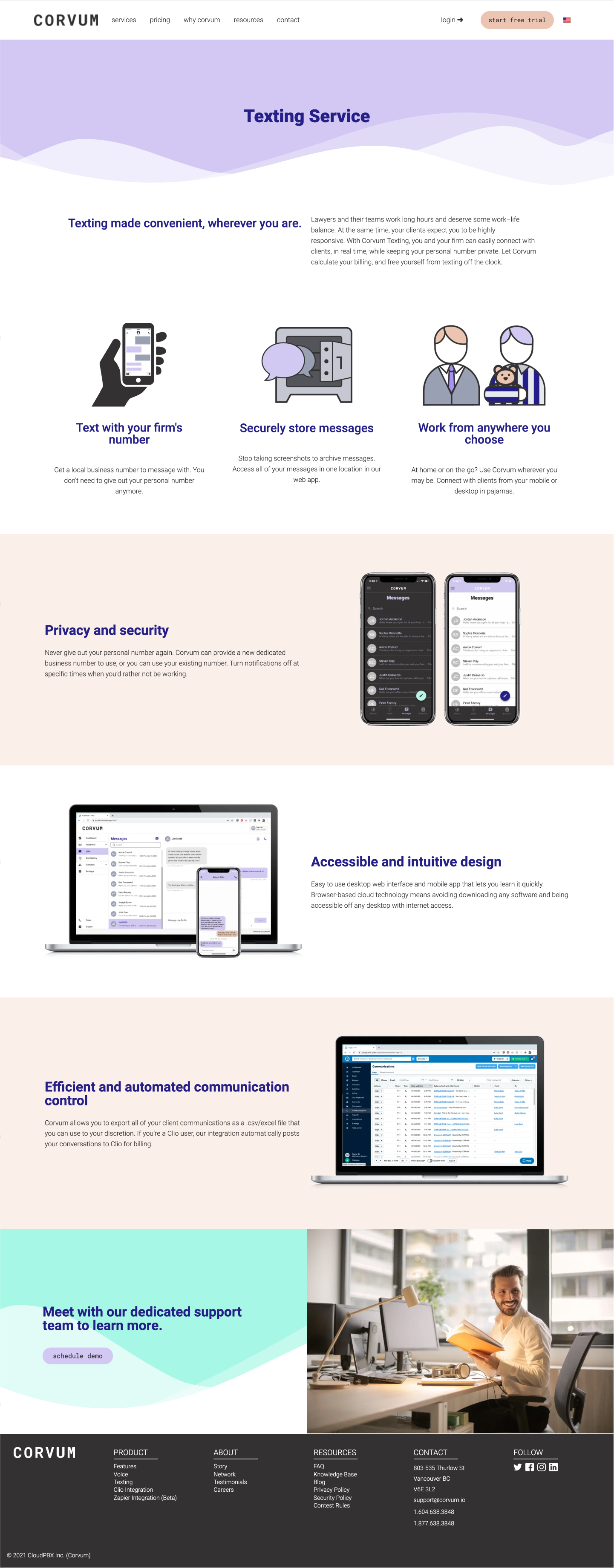
Taking these new navigation flows, I composed new UIs for each existing and new page. Utilizing WordPress and the Elementory plug-in, I was able to experiment and bring life to much of Corvum’s website through its robust colour palette that was missing in its original website construction.Click on the images to enlarge.
View the live website here.
Graphic Assets
Icons from the old website evolved with a refresh, starting from my predecessor and refined by me.My approach included used thinner line strokes and a variety of tints and shades from the brand palette for more personality and to be more eye-catching.

User Testing
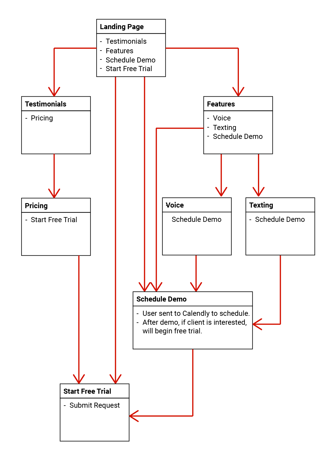
After testing the new design and user flows with coworkers and presenting to the CEOs, it was found that we were missing clarity in the types and options of services we provide.
This led to adding two new pages to our user flow to provide clarity on what “voice” (calling) an texting offers, providing more opportunity for buy-in to convert potential leads to starting a trial.


Further conversations happened regarding product offerings, leading to changing the bundles that needed to be displayed on uur pricing page. The design was also revised to appear to-the-point.
Redesign Reception
With our redesign, the company’s CEO received much praise from existing customers, partners, and colleagues. Much was spoken about the ease of navigation, clarity of purpose, and being able to get to starting a trial.After a month from the new website’s launch, visitor traffic increased by approximately 1400% with an increase of new leads.