PURKEYS SENTINEL
Product Logo Design
Overview
Purkeys Sentinel is a “low voltage disconnect” product for straight trucks with liftgates (think grocery store trucks).When liftgates are operating, they draw power from the truck’s battery. Often, liftgates will deplete the truck’s battery, preventing drivers from completing their job for the day/week, halting progress and requiring specific support to come and re-charge the battery.
This product measures the battery’s amount and depletion, cutting power from the liftgate once a certain threshold is met to ensure that the driver has enough power to turn their vehicle on.
Process
I was the lead designer of the logo and effectively communicating messaging for the product to ensure buy-in and setting the vision. The logo was planned to be used across all materials including email signatures, e-blast banners, and more.
I worked with one Marketing Manager on this project.
I worked with one Marketing Manager on this project.


Conceptualization
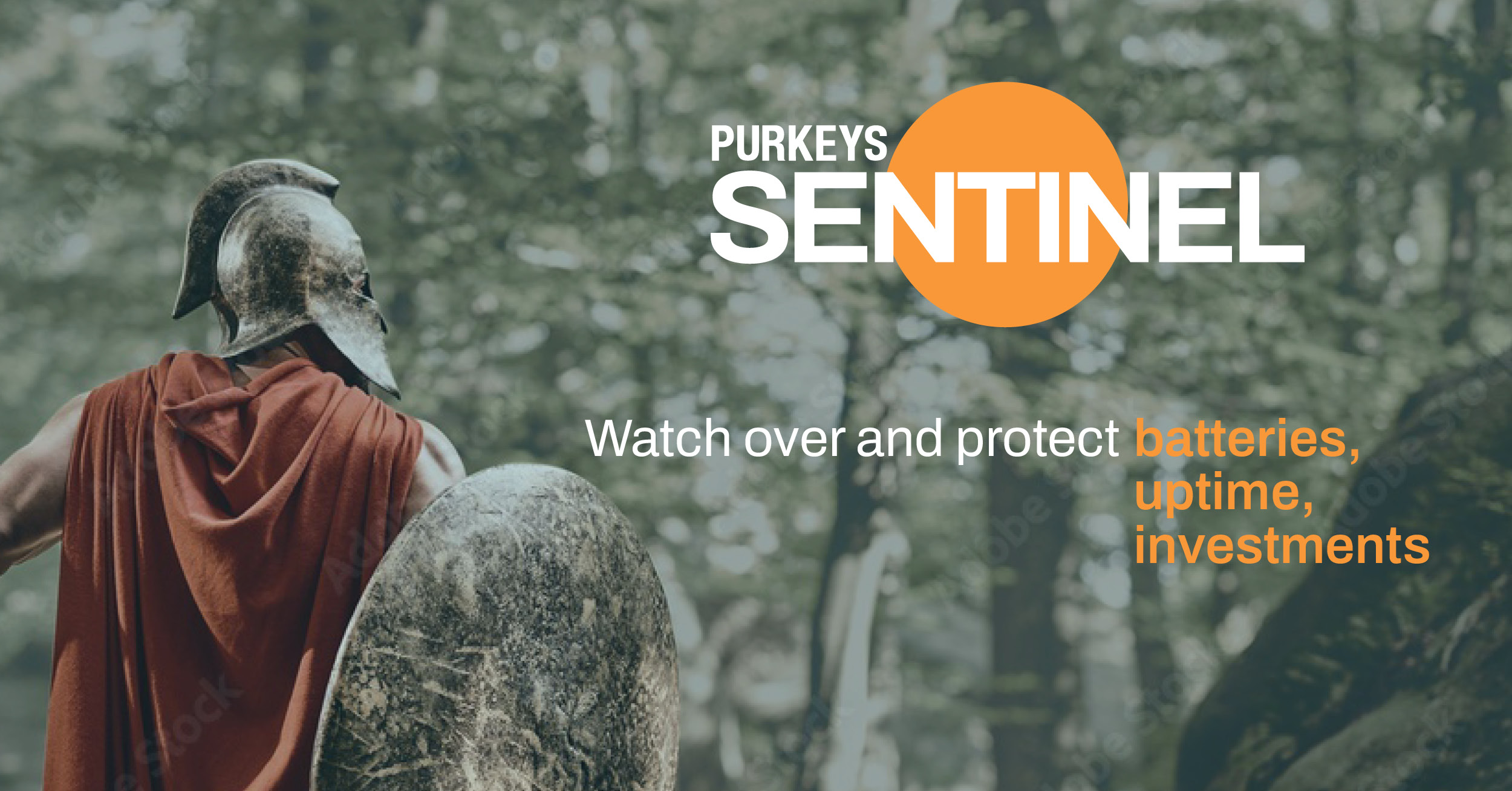
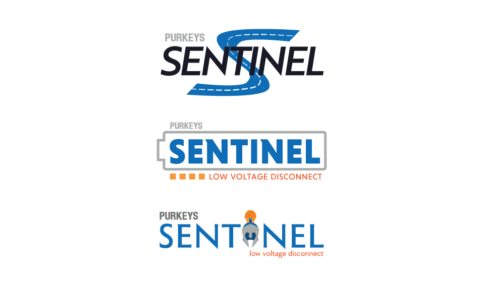
I was asked to prepare visual concepts to illustrate the concept of the “Purkeys Sentinel” as a “protector.”This was so the Marketing Manager can propose the product title to the sales team for buy-in before proceeding with logo concepts.
Visuals comprise mainly of the concept of a roman warrior coupled with the simple illustration of shields.
Research
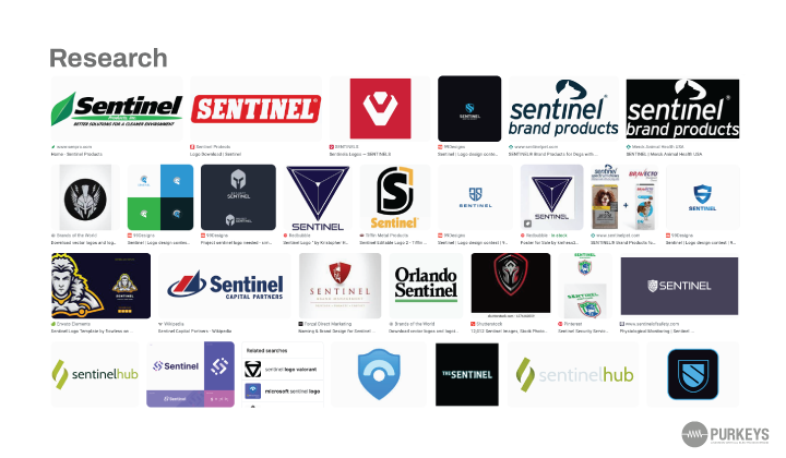
Market research was done to see what was already done with regards to the “sentinel.” This would help understand the cliches and existing ways it’s being communicated.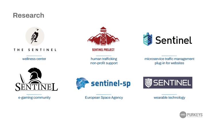
Noting what sector was tied to the different logos found helped with contextualizing why the logos were designed to match the industry.
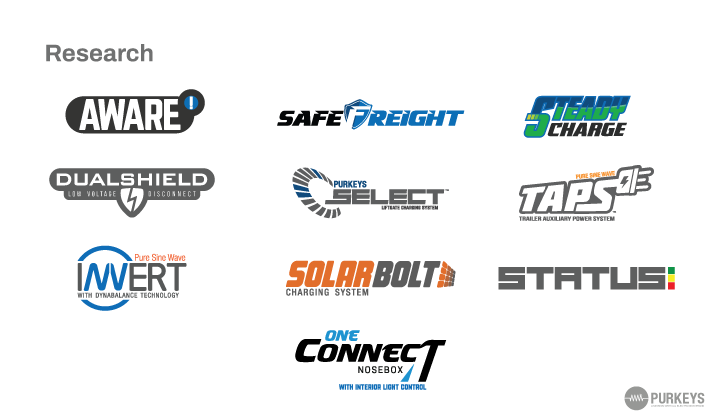
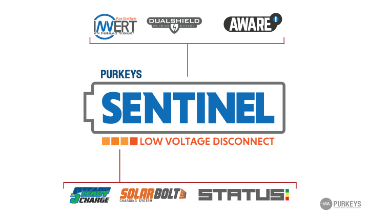
I then analyzed the company’s existing logos to understand the brand’s conventions to ensure the new logo I designed fit within existing standards.
Taking this knowledge, I sketched and mocked up rough ideas unique to our product.
Taking this knowledge, I sketched and mocked up rough ideas unique to our product.
Iterations
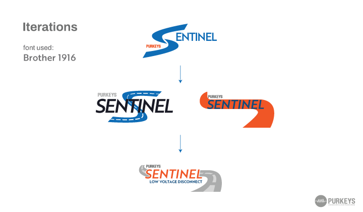
Over the course of a 2-week period, I would share iterations with my marketing manager.
After presenting the first round of iterations, we agreed that while the initial concept of the logo’s art direction revolved around this concept of the Sentinel being a protector, I needed to stray from that due to being a clear cliche.
For our final proposal to the Sales Manager and our Marketing Director, I switched the core of my concepts then revolved around the purpose of the product and the problem it aims to solve.


Option 1 - “Watching Your Battery Power”
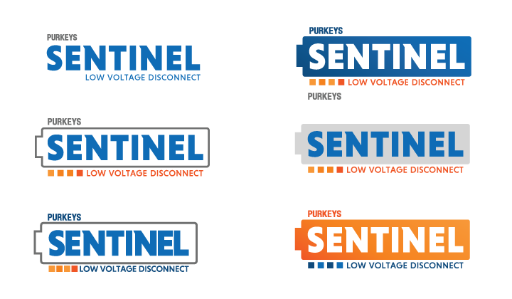
Iterations for this logo revolved around the product’s goal to “watch your battery power.” Since lithium-ion lacks a conceptional skeuomorphism, I opted for the traditional battery icon.The four squares below the battery are taken from the GUI of the product but to also illustration power range.
Graphic elements from the logo were also inspired or similar to existing logos to justify why the logo would fit.

Option 2 - “Getting you from Point A to Point B”
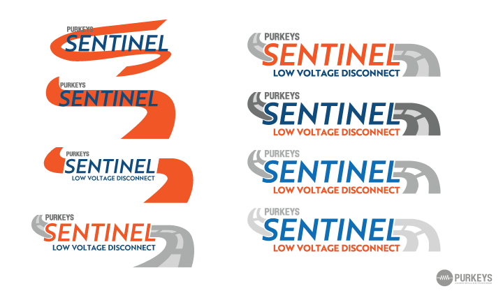
Iterations for this logo revolved around the product’s goal to “get from point A to point B” by illustrating a road going through “Sentinel.”
By illustrsting a road going through “Sentinel” I hoped to communicating the product’s goal to “get drivers from poing A to point B” without hiccups and battery issues.
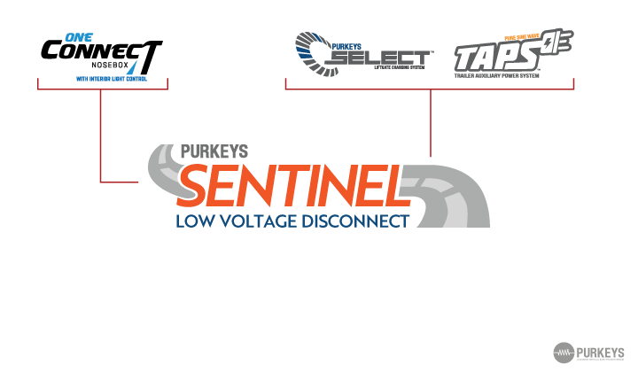
Like option 1, graphic elements from the logo were also inspired or similar to existing logos to justify why the logo would fit.
By illustrsting a road going through “Sentinel” I hoped to communicating the product’s goal to “get drivers from poing A to point B” without hiccups and battery issues.
Like option 1, graphic elements from the logo were also inspired or similar to existing logos to justify why the logo would fit.


Final Decision
After reviewing the final two options. The team proceeded with option 2.While praise was given for both options, they believed message behind the Sentinel is less about batteries and more about getting to where you need to go.