WINGS VOCAL COLLECTIVE
Logo Redesign

Overview
I was hired as a freelance designer to redesign a local singing group’s logo. Through rounds of review and iterations, a new design was created that honoured the origins of the group and provided a fresh look for the group.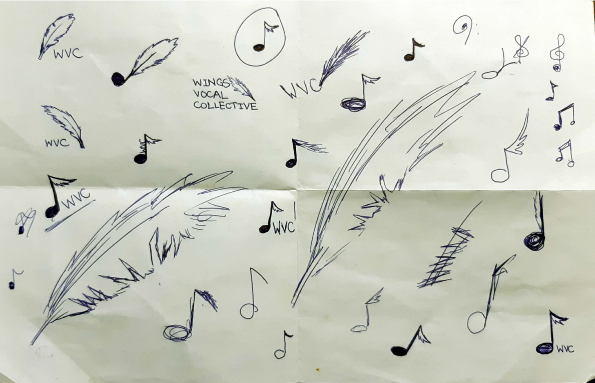
Sketches
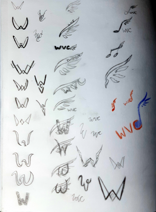
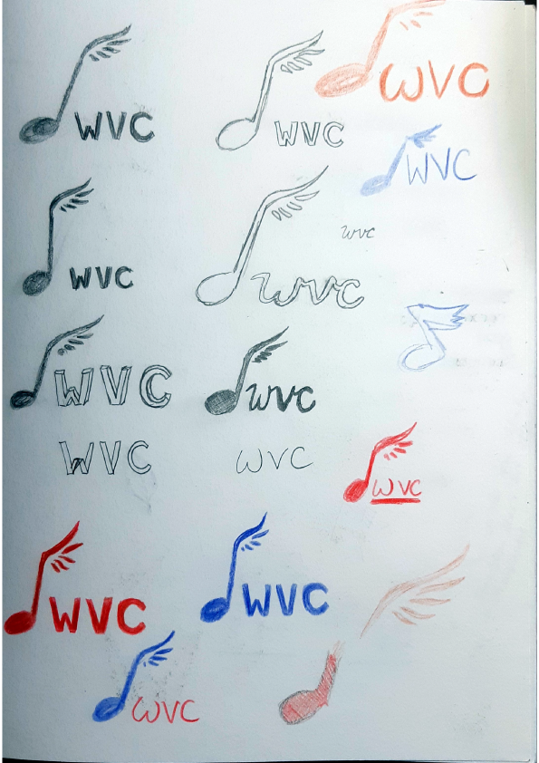
A majority of the process was at the iteration stage. The team asked that I retain their existing wing that has been used through their brand’s history. Through a variety of iterations were we able to conclude on a design to proceed with.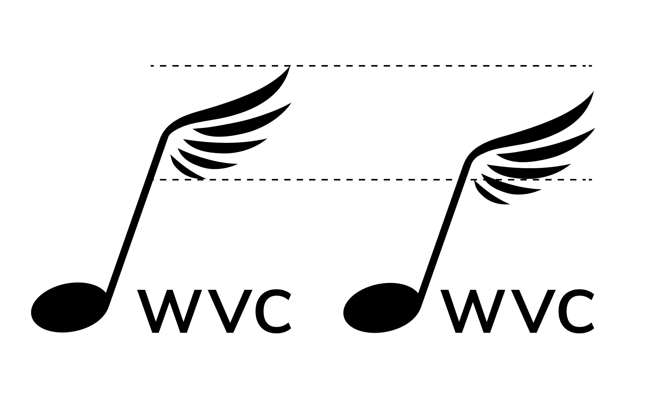

Digital
Through the digital iteration process, I continued to make variations, playing with height and figure-ground.



The design moved toward a more modern take of the logo going from an angled note to a vertical line, which helped with text alignment. I opted with a logo with a circle to contain everything into a single object.



Final Iterations
Wanting to stick with the main brand colour, the final logo suite consists of two variations (full name and acronym) with three colours each (maroon, black, and white).The singing group wanted options to choose from and requested a version of the logo that included the acryonym.